Preety Gift, an online jewelry start-up was in dire need to have a brand identity that would link target audience, not only women but also men, to the unique label. For the logo design, the client wanted to put emphasize on brand initial “preety”. Furthermore, something elegant and classy was in demand to represent the brand in its true sense.
Let me fill you in with details of the entire design process of the jewelry logo which was carried out.
Main Objective: To create an eccentric design for a online jewelry brand, that would put more value to the label.
What Tools were used: Adobe Illustrator, Figma , Adobe Photoshop
Design process of the logo:
I took up the challenge and started the big task of turning ideas into reality. Professional skill-set combined with imagination and creativity was brought into action, in order to give a face to Preety Gift. keeping in mind what the client wanted, a team of professional designers cooked up a few ideas to initiate the design process.
First Draft of ideas — A
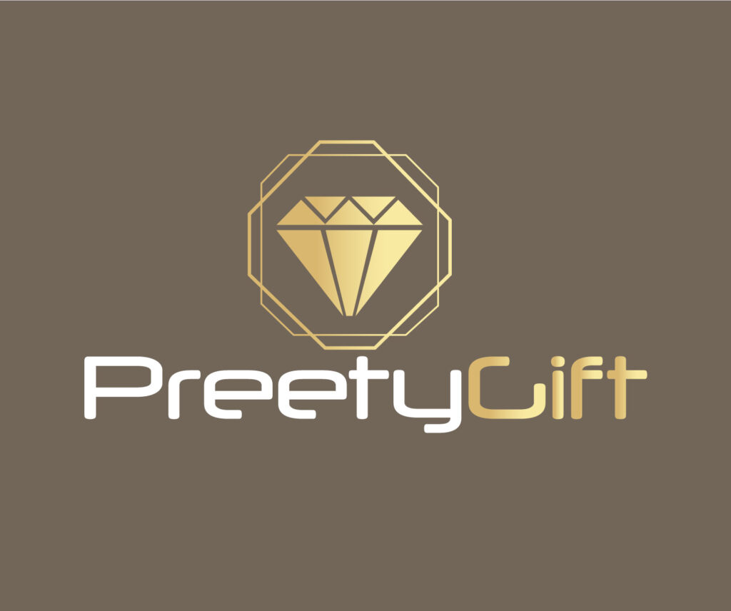
Taking inspiration from the very nature of the business, this design was conceptualized by showing a diamond inside the brand name. Underneath was written the name in golden color.
First Draft of ideas — B
Stylized brand name in golden, this design looked more elegant with the shape of a ring.
First Draft of ideas — c
In the third option, more focus was put on the brand initial. It was formed in a round fashion and it stood on the top to grab immediate attention. This abstract design gives notion towards jewels/jewelry brand as well.
What the client had to say
It turned out to be a successful effort reading what the client had in mind as the initial concepts generated positive feedback. The design which used the ring caught more attention and paved a way for the next step in the procedure. This particular concept enabled the client to understand the best options for their brand identity. Hence, they asked for more of this sort with a bit of variation.
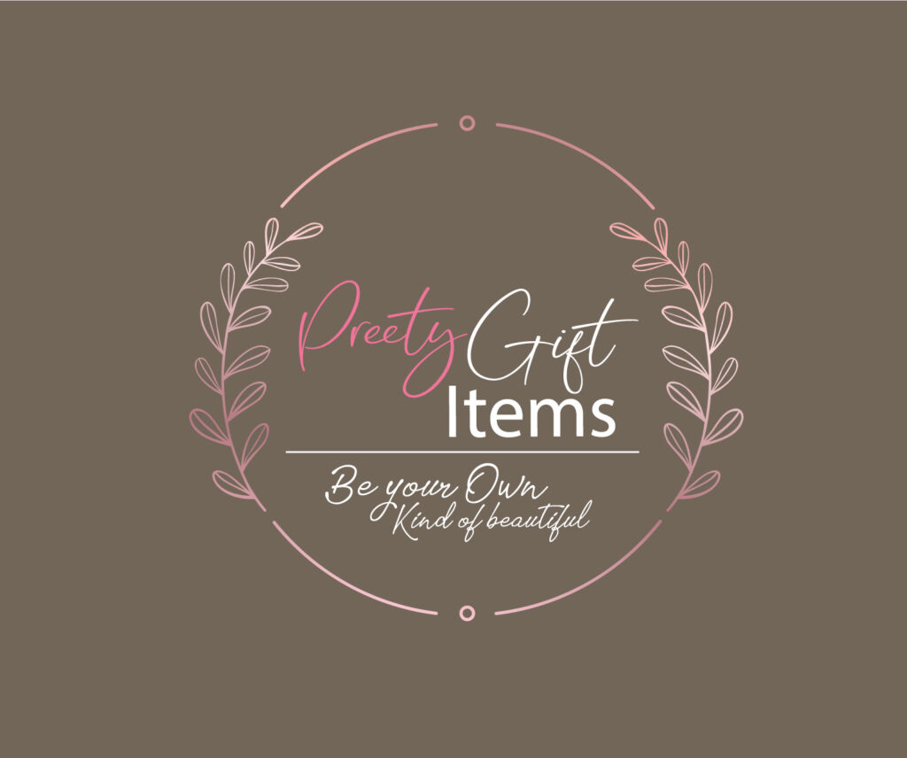
Second Revision
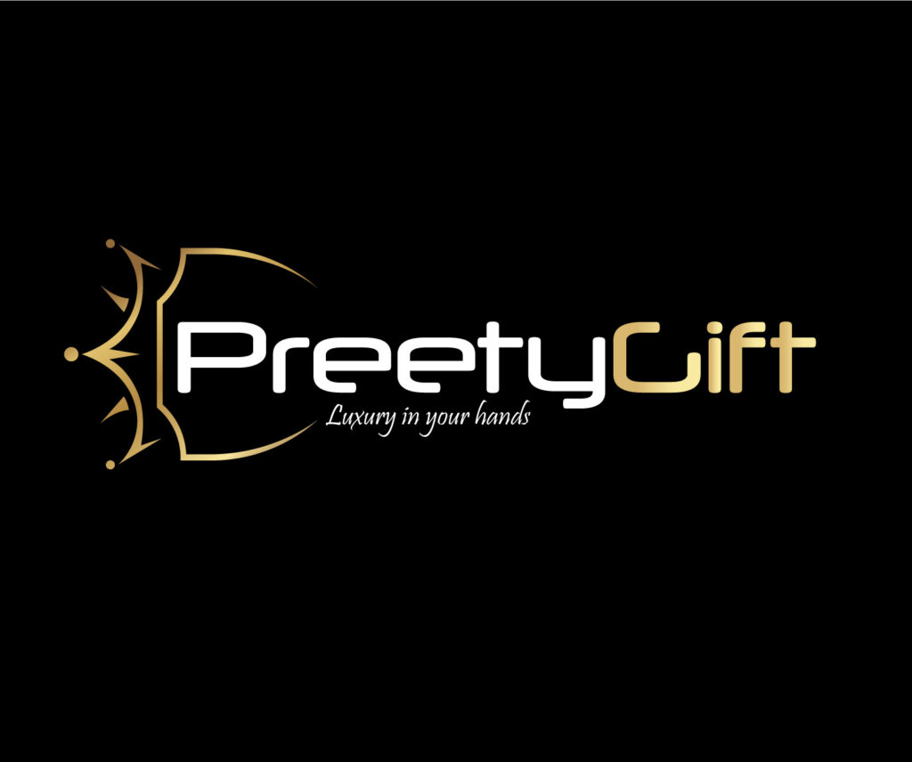
Further down the process, this catchy and more subtle design surfaced which straight away became the center of attention. In fact, the business owner had the vision to expand their business by adding more of men’s items to their product line. So, in connection with that the revised design made more sense and the client didn’t take logo to decide on this design. The previously favored sample with the diamond ring was seemingly more feminine, but the new design covered all aspects of brand representation.
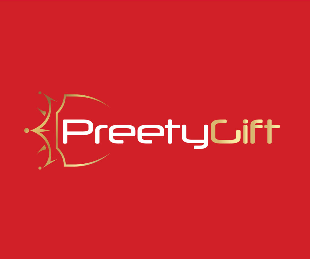
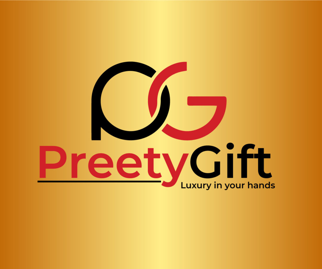
The Final Phase of Preety Gift Logo Design
In the final leg of the logo design process, we gave a finishing touch to the selected piece for Preety gift logo design. The team carefully examined the logo design from all angles and approved the final product. That’s how the eventual shape of the Preety jewelry logo design looked: