Let me tell you a story about a Learning Management App
Hello everyone! This time, I’m going to share my design process of designing Learning Management System Mobile Application. This is a project that I designed at CAP Youth Empowerment Institute an International NGO where I worked as the Lead Designer. I was in charge of the design process from start to finish.
My Role : UI / UX Design / User Research / Prototyping
Here is What My Role Entailed
Lead UI/UX Designer
I was the overall lead UI/UX Designer working with a team of 4
User Research
I lead and conducted all the user research components
Prototyping
Using Mainly Figma, I created prototypes at various stages undertaking various iterations
Background Story
Cap youth Empowerment institute is an International NGO tackling youth un employment by offering Basic Employability skills training to vulnerable youth and linking them to the job markets.The organization has been conducting the trainings purely offline but now there is need to have the same training conducted online.
What the Application aims to achieve
The app will enable seamless learning processes for the students , easy onboarding and training sessions for the teachers and instructors and finally a comprehensive feature for training management.
Design Process that I undertook
Design Process is a design iteration process to improve usability and optimize interface design. For this design I use Design Thinking as an approach to the design process. Design Thinking is an evolution of the Human-Centered Design process that can be used to create innovations in product design. The Design Thinking Process consists of:
Empathize
Define
Ideate
Prototype
Test
1 — Empathize
The purpose of the empathize stage is to assist the designer in finding out the views & needs of the target user by doing research before defining the problem statement and making ideation. At the beginning of empathize stage, participants are given a set of questions and Challenge Test where the empathy stage has been carried out and the results are as follows:
Users are not familair with an online learning platform
Users need a simple platform for learning
Users are concerned if the platform will take up much data
It’s hard to find motivation to learn
Can we learn from anywhere realy ?
Some users dont have smart phones, hence will have to settle for cyber cafes
Target User:
Age : 18–35 years
Profession: Students
Language: English,Kiswahili
Economic level: Middle to low income
With the results of this research, so I decided to create the platform with the aim of making it User Friendly with an attractive appearance and can increase learning motivation for learners when using the platform.
2 — Define
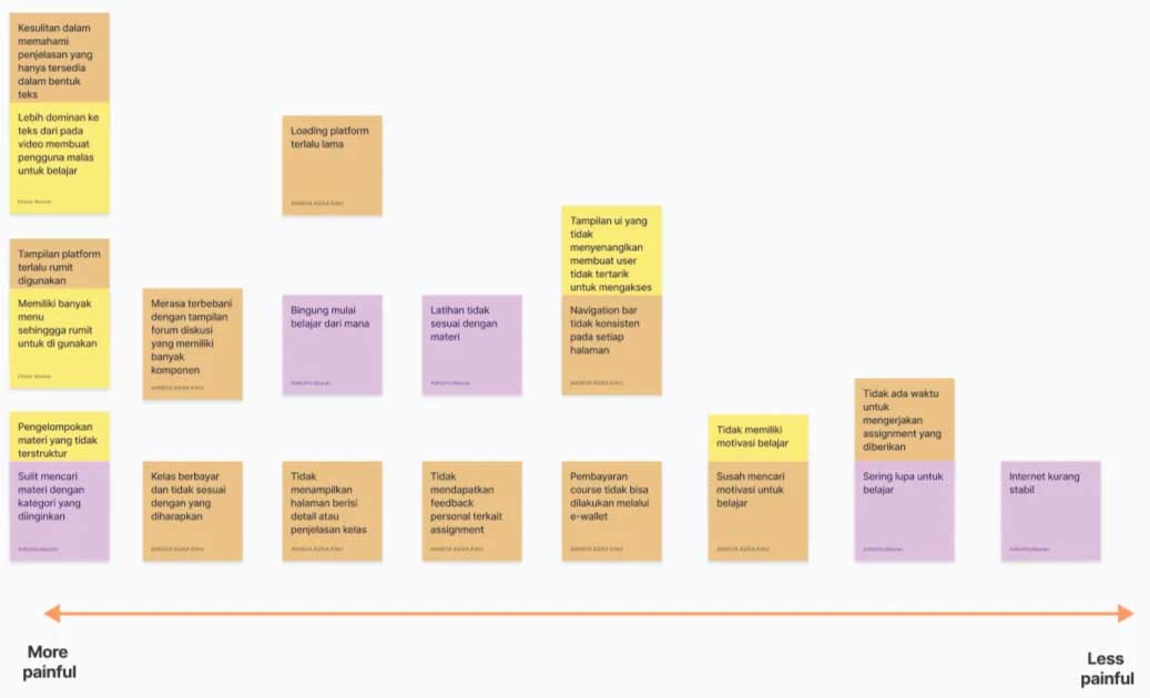
After collecting and analyzing all the information obtained from the empathize stage, the next step is to defining user problems from the results of empathize stage and making How-Might We as an opportunity. The define stage that I did consisted of making a list paint point of users from more painful to less painful and created How-Might We together with team members then we vote to choose How-Might We.
List Pain Points
How-Might We
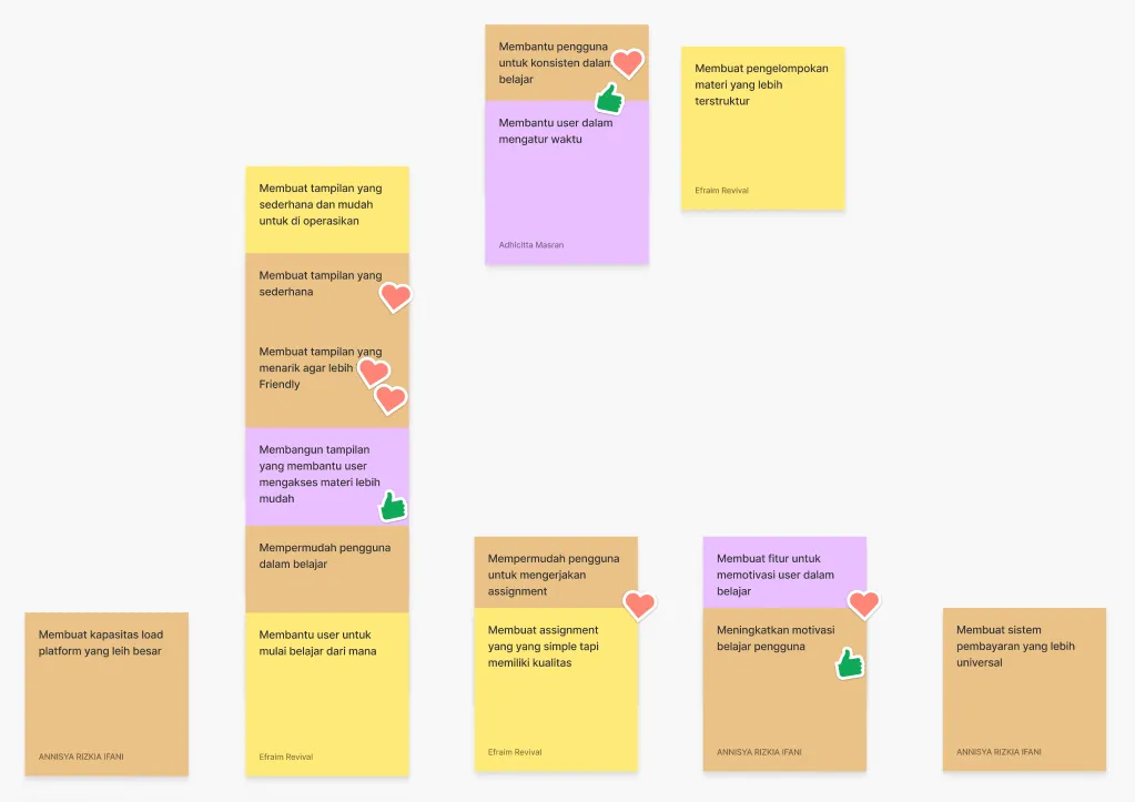
Final How-Might We: Create an attractive and easy interface to help users learn
3 — Ideate
After analyzing the pain points and opportunities, next is brainstorm ideas based on How-Might We, then formulate the best possible solution to solve the problems that have been collected in the define stage by making an affinity diagram which contains grouping solution ideas into several categories then prioritizing solution ideas according to user value and effort and finally making crazy 8’s. Crazy 8’s made on HVS A4 paper, folded into 8 frames, and drawn for 8 minutes.
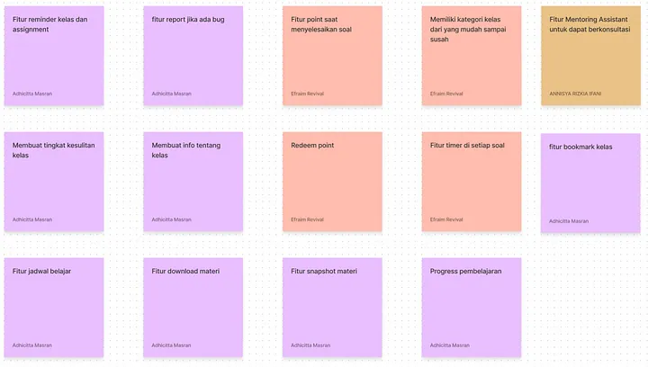
Solution Idea
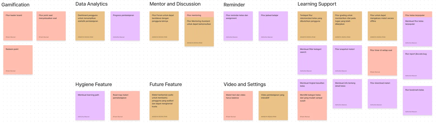
Affinity Diagram
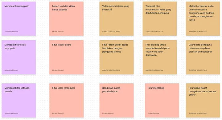
After getting the ideas that will be made later, we group the ideas by category. This grouping of ideas is commonly referred to as an affinity diagram. We got seven groups of ideas which are Gamification, Data Analytics, Hygiene Feature, Mentor and Discussion, Future Feature, Reminder, Video and Settings, and Learning Support.
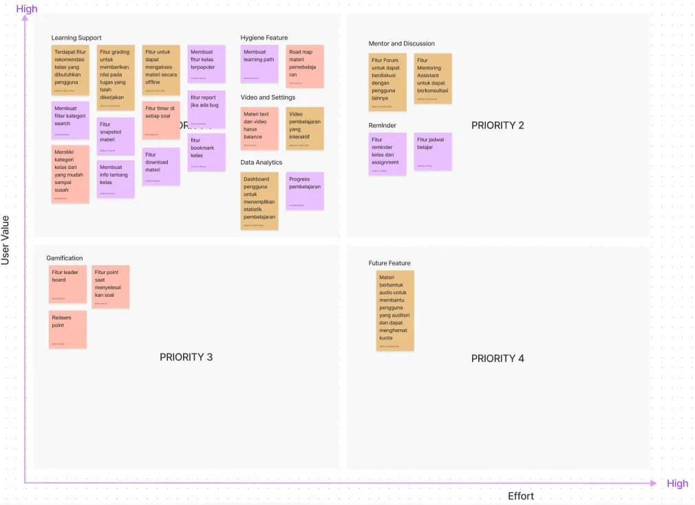
Prioritization Idea
Furthermore, the ideas that have been grouped are entered into the prioritization ideadiagram to determine the priority level of these features. By creating Prioritization Ideas, we can determine which ideas to work on now, work on next, work on last, and work on later and we can also determine the minimum valuable product (MVP) for the first version of the application. This prioritization process is carried out based on user value and effort.
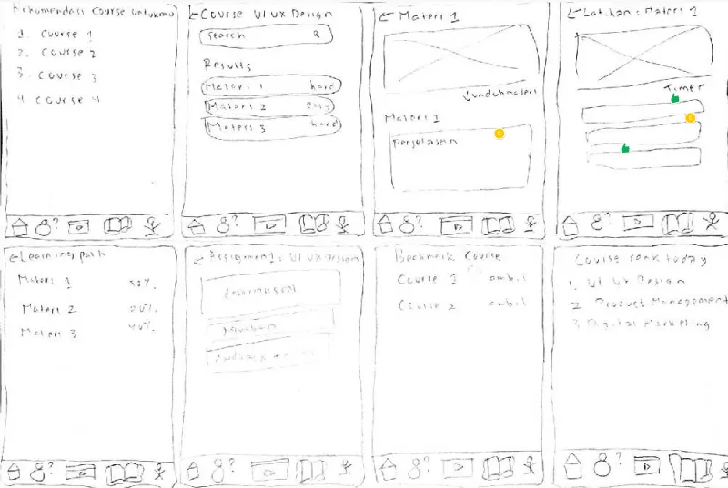
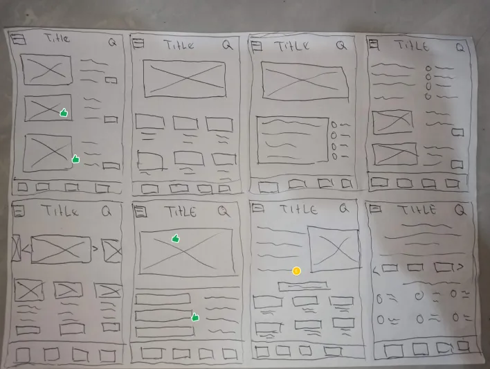
Crazy 8’s
After find out the solutions, me and the rest of the team made sketches using design sprint method, thecrazy’8. Crazy 8’s made on HVS A4 paper, folded into 8 frames that portray the rough layout of the mobile app, and drawn for 8 minutes.
.
4 — Prototyping
After Brainstorming ideas, Prioritizing ideas and Crazy 8’s, next stage is prototyping. At this stage will do several things such as created user flow, designing interfaces (low-fi and high-fi) from Crazy 8’s, arrange the user interface into a process flow that is in accordance with the solution idea, created UI style guide, then created a prototype that can be used for testing.
.
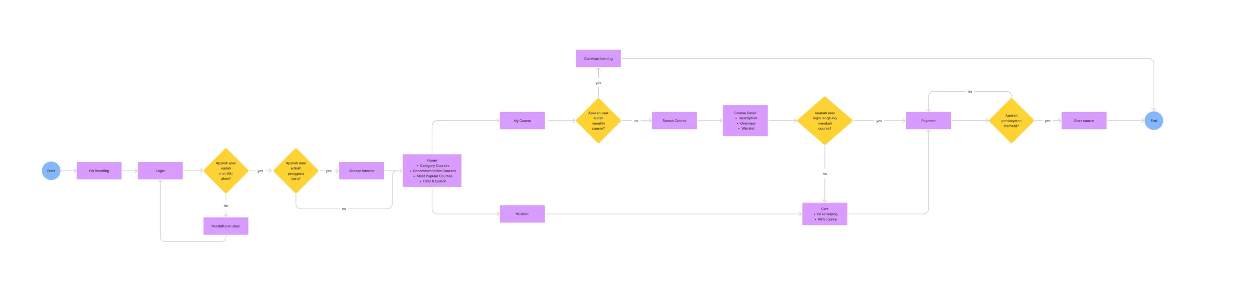
User Flow
User Flow is a diagram of the steps a user must take to complete a task. I use FigJam for making the user flow. I work on this user flow together with my team members. Here is the user flow for the design of this application.
.
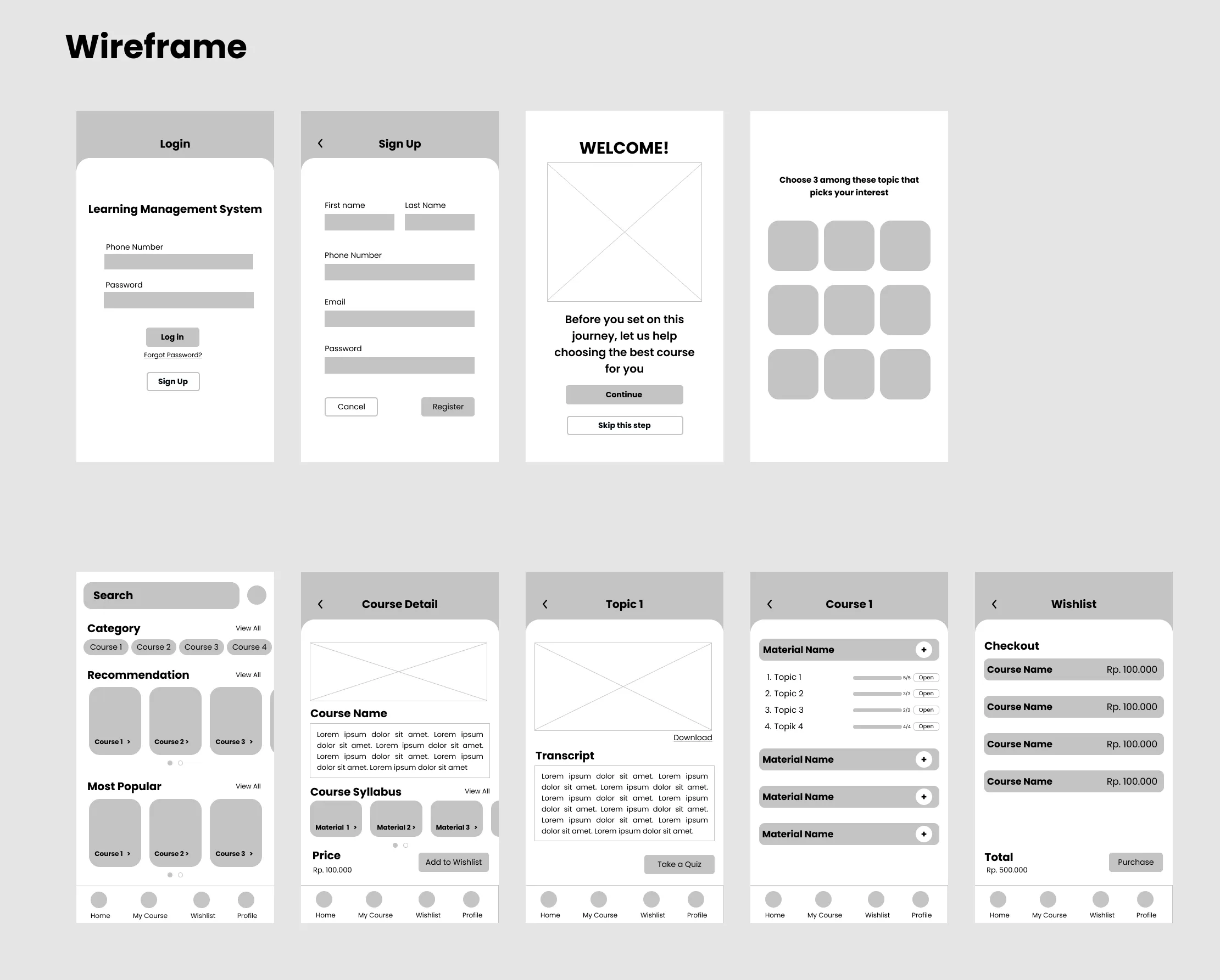
Wireframe
After making some sketches and user flow, I proceeded to created the wireframes. Wireframe is a layout in the Low-fidelity (Lo-Fi) version that can help designers present information in interfaces, provide an outline of the structure and layout of the interface, and speed up the ideation process. I also made a little changes as part of the ideas development of the rough layout in the sketch process.
.
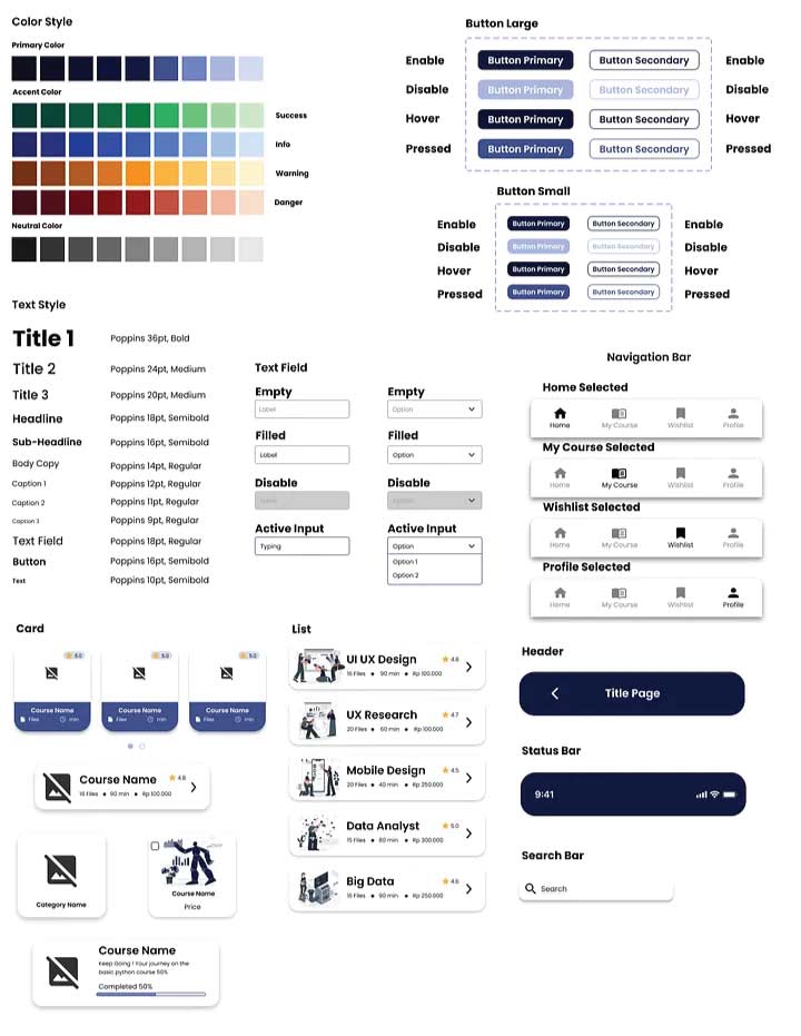
UI Style Guide
Here is the UI style guide that I use on the high-fidelity interface of this application. The reason why I created UI style guide is so that the UI Design can always be consistent whether it’s the color or size of similar elements.
.
Interface Design
After finalizing the ideate phase, then I continue to design user flow, wireframe, and, UI style guide, next step is I develop a high-fidelity prototype and beautifying the interface design, add some flows to make it interactive, and utilize the UI style guide that I created before.
.
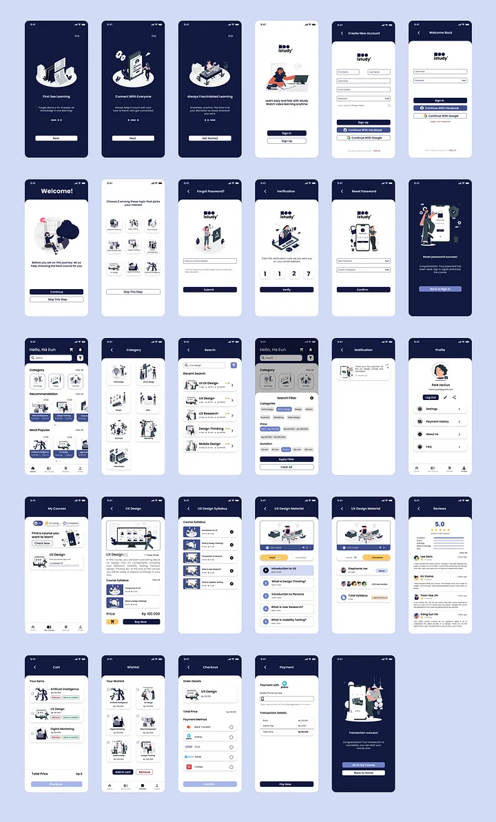
Interactive Prototype
Prototype is a 1:1 form of product display that will be developed but not yet real. Prototype is used to try & simulate the design solution that has been created. I created the interactive prototype on Figma. This prototype contains 67 (empty and filled) screens such as login, register, choose interest, course detail, learning path, and payment. Here is the interactive prototype that I have made.
5 — Testing
I did user research using In-Depth Interview and Usability Testing methods. This user research will was done through Google meet and inperson, participants will share screens while interacting with the prototype.
Research Objective:
Finding out user needs in conducting online learning.
Finding out user habits in doing online learning.
Find out the level of usability, convenience and satisfaction of the idea solutions offered in the Registration & Login, Course Search & Filter, Wishlist & Cart and Course Payment process flows.
Determine whether the user has a satisfactory experience.
Understand how users use the application.
Find out if users can make course purchases.
Find out what information users need to make a course payments.
Research Scenario
At this stage, I created 5 tasks and scenarios related to the product for usability testing. Here are 5 tasks and scenarios that I made to test the usability of this platform.
Task: Register an account and choose 3 topics that are of interest to users
Scenario: You are a student who wants to hone his skills so you decide to take an online
course. You choose to use the study application because it fits your needs. As a new user you
decide to choose 3 topics that you feel are of interest to you.
Task: Log In
Scenario: After creating a new account, how do you access the CAPYEI app?
Task: Do a search & filter
Scenario: You want to search for courses in the UI/UX Design category and do some filtering.
Task: Move courses from Wishlist to cart
Scenario: After doing some course searches and adding the course to your wishlist, you decide
to pay for a course.
Task: Make course payment transactions
Scenario: After entering the course you want to buy into the cart, you make a payment of the
course with the payment method you want.
Problem:
Users find it difficult to choose the payment method option on the checkout page. Opinion: In terms of design, it is excellent, easy to understand, and the flow is very clear. In addition, the home screen immediately brings up the recommendation and most popular sections, for users who have just created an account, this is a plus for the platform.
Suggestion: On the checkout page for the payment method section, it might be better if the one that can be pressed is not only the radio button, but 1 option can be pressed.
Furthermore, in the course filter section for the price filter section, it would be better if you could use slides (2 slides for max and min prices) to be more flexible.
Single Ease Question
After users complete all of scenario, I ask users about the overall level of process flow in the context of design and convenience with Single Ease Question. From 1 to 7, all of the users gave me number 6.5 which signifies that design of this solution is very easy to use.
Conclusion and what we Learnt
In conclusion, the users gave a score of 6.5 out of 7 which means that the respondent was satisfied, happy, and enjoy by the design of this solution.
The lesson I can take is that in designing UI/UX, it’s not just about creating a beautiful display, but also how to create a beautiful display that users can use comfortably and efficiently. Hopefully in the future this solution design can be developed into a real application product.
Next Updates and Product Version
Since this was the first design for the App, I felt that there was still a lot for improvement to be considered. This design is made based on the thoughts of team members and my personal assumptions, I hope this design can be the right solution for students who want to access employability skills from anywhere. The App will definatly undergo future updates and changes depending on the demand of certain features and courses.